The Shrine is turning 90. But should it have even been built?
It was the project that divided Melbourne and split the architectural community. A new exhibition reopens the city’s post-war wounds.
By Ray Edgar
Credit: Judith Green
How should architecture acknowledge the supreme sacrifice? It’s a question that tested architect Ian McDougall, who, like most of us, is conflicted about war. During the Vietnam conflict he joined the protest marches. Yet he also respected veterans like his father, a highly awarded World War II career soldier. Then in 2000 McDougall’s firm, ARM, landed the job of designing additions to the Shrine of Remembrance. Once again he had to reconcile his beliefs.
“It allowed the creative process to embrace all of the terrible, tragic emotions that war brings,” says McDougall. “The Shrine is steeped in those stories. It is one of the most profound, most moving structures in Australia.”
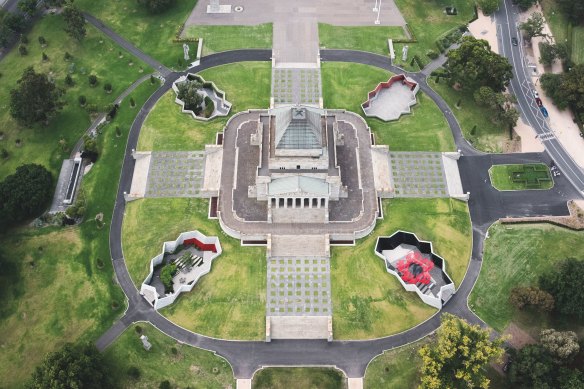
ARM’s designs for additions to the Shrine of Remembrance inserted four courtyards on the original design’s four axes.Credit: John Gollings
Yet, historically, achieving such a profound architectural statement was hard won. In the aftermath of the First World War, power brokers and the public wrestled with what form the memorial should take, the choice of location, and whether a monument should be built at all. Some argued that its exorbitant £250,000 cost (roughly $30 million today) would be better spent on hospitals or financial aid to veterans and their families.
They too were troubled over the moral ledger. Reviewing the Shrine design competition in 1924 in Art in Australia, artist and critic William Blamire Young expressed the newfound disillusionment: “We have learnt to distrust words. Even those of such good repute as ‘patriotism’ … stand for a sentiment that is full of menace to the world’s peace.”
A triumphal tone in architecture should be tempered, Young cautioned. “We must pick our way with care lest what we set down in stone today may prove to be a monument of our own inability to learn the lessons of the war, rather than the memorial to the fallen which we intended to make it.”
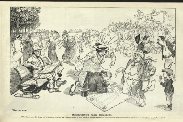
‘Melbourne’s War Memorial’, 1924, by Tom Glover, The Bulletin, September 21, 1924. Credit: The Newspaper Collection, State Library Victoria.
For the first time since 1924, when the competition was originally judged, we can see the entries that the public argued over and judge for ourselves in an exhibition marking the 90th anniversary of the Shrine’s unveiling. So would an alternative design have endured equally well?
“They’re all designed by the ‘starchitects’ of their day,” says Shrine co-curator Neil Sharkey. The exhibition required sleuthing. The original 83 entries were destroyed by fire in 1925. Curatorial research by historian Dr Laura Carroll and architectural historian Dr Katti Williams unearthed original drawings and watercolours from architects’ relatives, as well as facsimiles from contemporaneous publications. Twelve entries have been assembled, including the top six shortlisted entries.
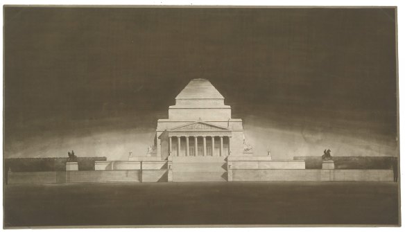
The winning design by Philip Hudson and James Wardrop.Credit: Shrine of Remembrance
If today Ian McDougall’s military connections seem noteworthy, a century ago virtually every Australian was touched by war. Almost 40 per cent of Australia’s male population aged between 18 and 44 enlisted in World War I. Of the 416,809 who did, an estimated 62,000 died. When the guns fell silent, acknowledging the sacrifices of the “war to end all wars” clearly demanded a memorial.
“It would commemorate all who served, as well as all who died,” says Williams. “But it also had to deal with this really important issue – that the Australian war dead were absent. The Imperial War Graves Commission determined that the dead would lie where they fell. But it was much more heightened for Australians because they were on the other side of the world.”
The competition had no proscriptive brief other than the Domain location, which at the time offered unimpeded views of Port Phillip Bay and the city.
The architects entering the competition were all too aware of the stakes. Many had served in the Great War themselves, or had loved ones who were killed or were lucky to survive. Runner-up William Lucas lost his son. Philip Hudson who, with James Wardrop, designed the Shrine we now see, served in the war and lost two brothers. Wardrop won a medal for valour.
Indicative of the project’s personal importance is the scale of monuments proposed. “They are all enormous, grand structures,” says Sharkey. And, in lieu of an actual grave, almost all had a stone of remembrance of some kind as a point of focus.
Perhaps surprising to 21st century eyes is that while the Great War caused an immediate and cataclysmic shift in literature and visual art, the shock waves had yet to penetrate architecture. Sober, unembellished international modernism lay in the future. Classicism dominates the entries. This is understandable. There were parallels. By 1920 the victorious British Empire held dominion over a quarter of the Earth’s landmass, justifying allusions to the Classical Greek and Roman Empires.
“It almost becomes a natural recourse for architects to look back to classicism, to try and capture these senses of heroism,” says Williams.
Sweeping colonnades, soaring pylons, triumphal arches, monopteroi (circular colonnades supporting a roof), columns, porticos, cenotaphs – the visual language of history’s victors – feature in the entries.
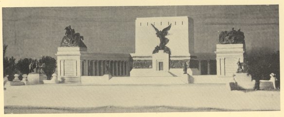
Coming fifth place in the Shrine design competition was this cenotaph surrounded by colonnades, designed by Arthur Stephenson and Percy Meldrum.Credit: Shrine of Remembrance
Arthur Stephenson and Percy Meldrum doubled down on the classical forms, producing two shortlisted entries. A cenotaph surrounded by colonnades received fifth place, cenotaph while their collaboration with Harold Desbrowe-Annear, a triumphal arch, came sixth.
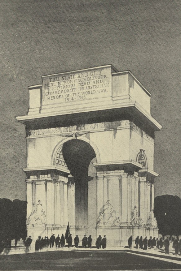
A triumphal arch designed by Arthur Stephenson, Percy Meldrum and Harold Desbrowe-Annear came sixth in the competition.Credit: Shrine of Remembrance
Australian motifs are rare among the finalists. The exception is fourth-placed team Edward Billson and Roy Lippincott, who incorporated flora and fauna into their Sanctuary of Peace. “Billson’s design avoided staid British Imperial classicism in favour of a more dynamic American form,” says Sharkey. “His design foreshadowed many later Australian memorials.”
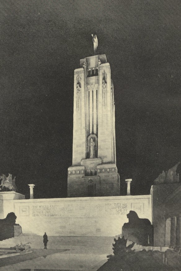
Edward Billson and Roy Lippincott’s fourth-placed entry was the only one to include Australian motifs.Credit: Shrine of Remembrance
Donald Turner’s third-place entry reflected his experience designing memorials and cemeteries at Gallipoli for the Imperial War Graves Commission. The towering Pylon recalls the Cape Helles and Lone Pine memorials. “It brings the Gallipoli Peninsula home to Australia using very similar forms and proportions,” says Williams. “It has that vertical striving to the heavens that a lot of the monuments had, but it’s very much anchored to the ground by the slight curvature of the colonnades.”
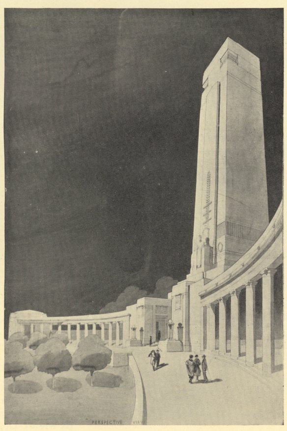
The towering Pylon at the heart of Donald Turner’s third-place entry recalls the Cape Helles and Lone Pine memorials.Credit: Shrine of Remembrance
The association with Gallipoli also materialises in Hudson and Wardrop’s winning entry. Respecting the classics, their design adopts the pyramid roof form of the Mausoleum at Halicarnassus. One of the Seven Wonders of the Ancient World, the Greek ruins lie in modern-day Turkey.
“While it wasn’t as dramatic as some of those tall, pylon-like designs, the fact it had a very specific connection to Gallipoli and timeless aspects of architecture was quite remarkable,” says architectural historian Philip Goad. “What’s interesting about the winning design is its mixture of mausoleum and temple. It’s such a curious hybrid.”
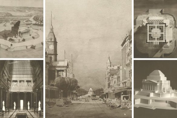
The winning entry, by Philip Hudson and James Wardrop, clockwise from main: the view from Swanston Street; top-down sections; model; the inner sanctuary in a watercolour by Philip B. Hudson; oblique view looking down. Credit: Shrine of Remembrance
Not everyone was so enamoured. The defeated Lucas was incensed by the judges’ choice. “There really is an ideological difference between the two,” says Sharkey.
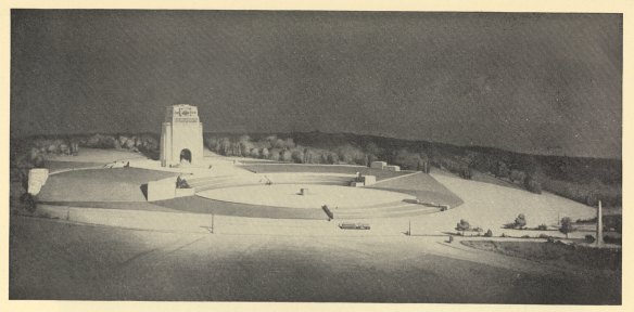
Runner-up William Lucas wanted a more egalitarian approach.Credit: Shrine of Remembrance
“[Wardrop and Hudson’s design] is an enclosed space with an inner sanctum, like a secret, solitary place where people can go and reflect. Whereas Lucas’ design is a big open space, modelled on an ancient Roman amphitheatre, where the community stands together and witnesses these commemorative events. It’s more egalitarian, more public. And that’s why Lucas was so furious when his design didn’t get up.”
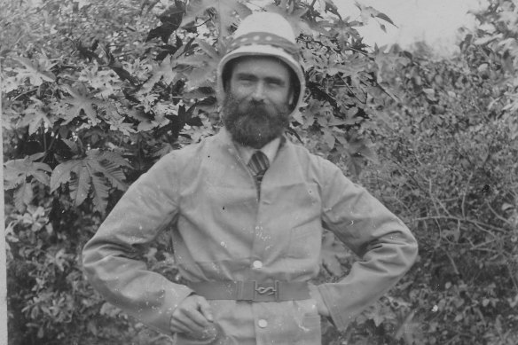
Runner-up William Lucas was incensed by the judges’ choice.Credit: Shrine of Remembrance
Lucas accused Hudson and Wardrop of plagiarism. Odd considering every entry, including his own, borrows from history. The accusation “created outrage among his peers”, says Sharkey. The Royal Victorian Institute of Architects expelled him.
There were, however, other critics of the winning entry. In Art in Australia Young criticised the melange of classical references and what he considered their failure to “knit together”.
The only entry in this exhibition to break away from classical tropes was designed by Walter Burley Griffin, Marion Mahony Griffin and Eric Nicholls. Constructed from rows and columns of 1.5 metre modules, its size could be increased or decreased as desired. An intensely lit shadowy drawing, it looks like a still from a German expressionist film.
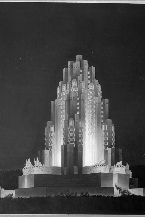
The Shrine designed by Walter Burley Griffin, Marion Mahony Griffin and Eric Nicholls didn’t make the shortlist. Credit: Shrine of Remembrance
“That is the most radical modern design,” says Goad. “The stepped pyramid form with its stepped pyramid interior is extraordinary. It’s like a holy mountain, a Hindu shikhara with this holy cave inside it.” Think of the Griffins’ crystal-inspired interior of the Capitol Theatre in Swanston Street, says Goad: “That’s the spirit they wanted. The crystal mountain represents the life force coming from the Earth. It wouldn’t have been popular.”
One of the curatorial discoveries is a sepia watercolour of the Shrine’s interior sanctuary. It reveals details of sculptor Paul Montford’s sentinels embodying values such as love, peace and courage that were planned to alternate with the black granite columns surrounding the stone of remembrance. “It’s far more detailed than we’ve previously been able to see,” says Williams.
A lack of funds meant some features weren’t realised. But there were memorable late additions too.
General Sir John Monash was instrumental in building the Shrine. He advocated for a memorial, helped judge the competition, raised funds, and championed the winning design for its interior “soul”. He also suggested what Goad calls the Shrine’s “masterstroke”: an aperture allowing a ray of light to pass over the stone of remembrance’s inscription, “greater love hath no man”. Once a year at 11am on Remembrance Day it illuminates the word “love”. This “pregnant suggestion”, as Monash modestly described it in a letter on display, was a late request from the general to the architect.
If these original entries were memorials to the absent, ARM’s 21st century addition was designed for the veterans whom age had wearied, who could no longer pay their respects without assistance. “The only way [they] could get in was they got carried up [the Shrine stairs],” says McDougall.
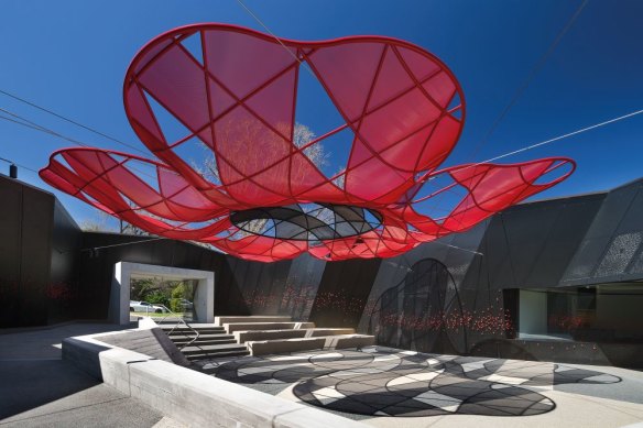
Poppy red, the motif of remembrance, is a feature of ARM’s additions to the Shrine.Credit: Shrine of Remembrance
ARM’s strategy “embraced the idea that our additions would carry the same narrative conceptual structure that the Shrine had,” he says. “But it would have specific narratives in it that relate to the stories of the servicemen and women.”
ARM inserted four courtyards on the original design’s four axes and incorporated exhibition and education spaces beneath the Shrine. The new entrance is emblematic of the multiple references the architects layer into the design.
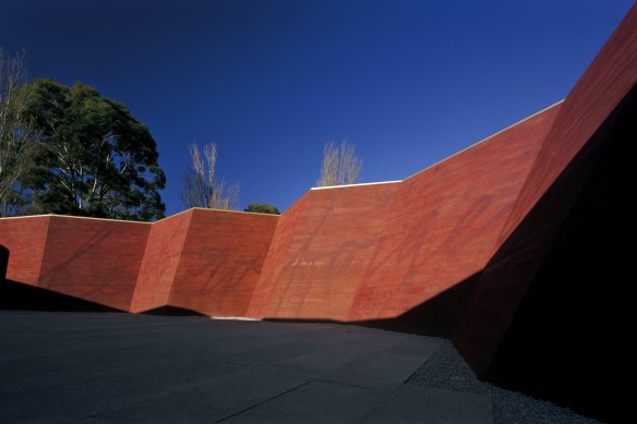
ARM’s off-form concrete trench walls are overlaid with the poignant phrase “Lest we forget”. Credit: John Gollings
Off-form concrete trench walls are colour-matched to the blood-red binding of C.E.W. Bean’s history of the Australian Imperial Forces. Subtly overlaid on the walls is the poignant phrase “Lest we forget”. The “super graphic” nods to street art and peace activism, yet is overwhelmingly respectful. Cast in copperplate script, this dreamlike ghost sign in its ghostly hall resembles a letter from home.
Other courtyards exude renewal with plantings from battlegrounds. Poppy red, motif of remembrance, recurs throughout the site; most dramatically in the auditorium where scores of origami-inspired peace-crane reliefs provide acoustic walls.
In an era when contemporary memorial design invariably defaults to modernist monoliths, ARM bucks the trend. Ironically, this often larrikin practice’s insistence on layered narratives salutes the classically inspired entries in the original competition. Visual languages may change, but stories of sacrifice are universal.
Designing Remembrance: Alternate visions for Victoria’s War Memorial is at the Shrine of Remembrance, August 13 to August 2025; shrine.org.au
A new generation
To mark the 100th anniversary of the original competition, we asked local architecture and design students to imagine a new Shrine. Their thoughtful responses echo the enduring challenges that come with commemorating Australia’s wartime experiences. Below, we ask readers to choose their favourite approach.
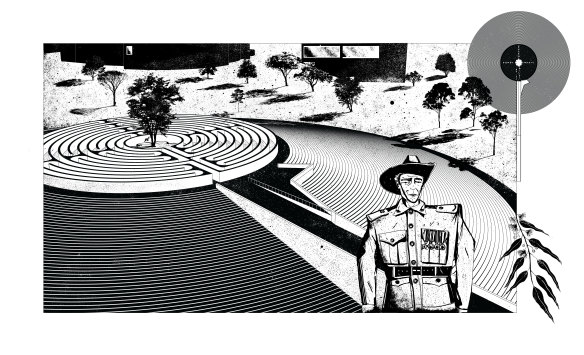
Benjamin Allen, RMIT, 4th Year
The design comprises four elements: the precession, the hill, the labyrinth, and the garden. It aims to redefine our role in remembrance. The Shrine encourages engagement with the space, fostering an active role in reflection rather than a passive one. Pointing down the Swanston Street corridor, the precession reaches out towards the city, creating a continuous path from the street to the crux of the Shrine. At the base of the hill, stone steps ascend upwards. Atop the hill lies a great labyrinth, leading to a garden with a lone pine tree at its centre. The labyrinth represents sacrifice, while the garden embodies life, rest, peace and freedom. Climbing the steps, traversing the precession, and walking the labyrinth are all active engagements with remembrance. In the plan (top right), I designed the shrine as a poppy, although it could also be envisioned as a roundel or the landing gear of a Lancaster.
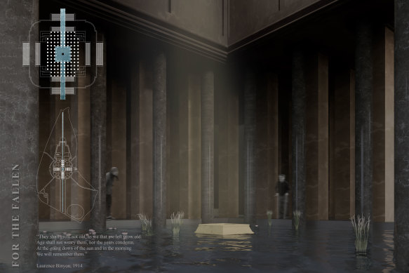
FOR THE FALLEN
Andrea Winata, Josephine Michelle Cipto, Haydian Susanto, University of Melbourne, Master of Architecture
“They shall grow not old, as we that are left grow old: Age shall not weary them, nor the years condemn. At the going down of the sun and in the morning we will remember them.” – Laurence Binyon, 1914
Soaring high in the centre of Melbourne, the Shrine stood as a memorial for the fallen soldiers from all wars. Each year, relatives and friends of the veterans would pay their respects. However, the Shrine of Remembrance itself is argued to be a museum rather than a mausoleum. “For the Fallen” references the poem of Laurence Binyon; the proposal seeks to imbue the Shrine with the symbolism of light. For the soldiers’ freedom, the plan envisions opening the central well to be illuminated with moonlight, illuminating the Shrine and its surroundings. The oculus above symbolises the journey beyond for those who have fallen. The body of water encapsulates the well, reflecting light from day to night. Relatives send prayers from the river to the centre of the well, believed to be delivered through moonlight.
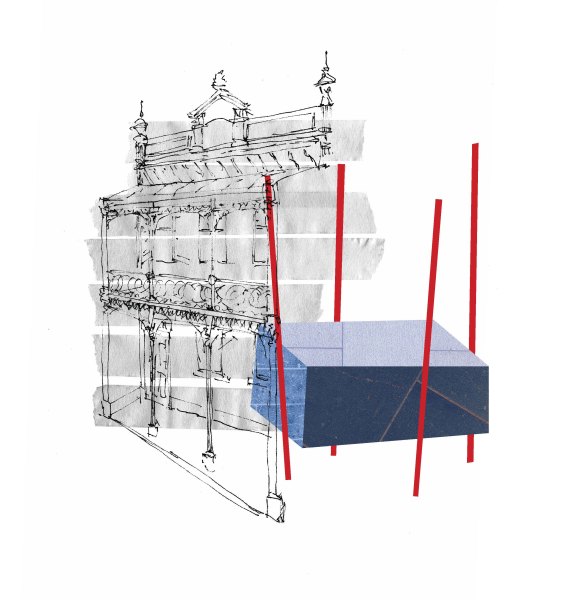
SHRINE V. SHRINE
Dexter Percival-Cobb*, Master degree of Architecture, RMIT
The etymological relations of the word “shrine” can link to words meaning “a tomb for a saint (usually elaborate and large)”, and “case or box for keeping papers”. To enshrine is to “place (a revered or precious object) in an appropriate receptacle”. When viewed as creation of shrine through definitions, a tension emerges between large and elaborate, and small and regular.
In the Shrine of Remembrance, the “precious object” is The Unknown Soldier, whose receptacle is of a scale fit “for a saint”. The Unknown Soldier’s symbolic purpose is clear, as “all of them. And he is one of us” (Paul Keating, Eulogy to the Unknown Soldier, 1993), but his saint-worthy receptacle contradicts this purpose.
Perhaps a contemporary Shrine should lay these tensions to rest. In between elaborate and regular, large or small, lies the exact scale and detail of the home – as “one of us” in our home of Melbourne, the Victorian terrace fits the bill.
Within the terrace house, internal walls are replaced with steel columns, opening the space while maintaining its memory. In its centre is a bluestone tomb, with a skylight above, shedding light onto The Unknown Soldier. Quaint and familiar, “Shrine v. Shrine” replaces monolithic expression with a common Melburnian memory of space. *Dexter Percival-Cobb is the son of Spectrum editor Lindy Percival
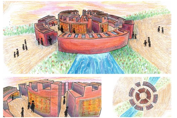
Swathi Tharmaseelan, Bachelor of Design, Melbourne University
The poppy was the main inspiration for the form of the Shrine, symbolising the endurance of those who fought for our country, and how the flower stood tall. Its contemporary yet recognisable form ensures relevance to younger generations, helping to keep the lives lost from being forgotten and supporting the idea, “Lest we forget”. The water and natural features symbolise the Shrine’s connection to the seas and countries where Australians fought. The open space embraces natural light, illuminating the engraved names of those lost to war, and also adapts to the chaotic Victorian weather to enhance the storytelling aspect of the design. Rainy days and sunny days would provide unique visiting experiences in commemorating the happy and painful days endured by Australian nurses, soldiers and medics, preserving not only their name, but also their memory.
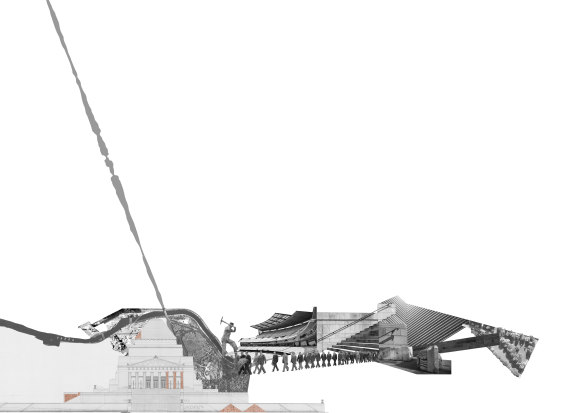
IN SITU
Kayleb Wilson-Crosbie and Oscar Eltringham-Smith, RMIT architecture graduates
“In situ” proposes a deconstruction of the Shrine of Remembrance – a succession plan cognisant to the Shrine’s layers of cultural consciousness, extending itself beyond King’s Domain and ingraining itself within a wider composition of its city.
On November 11, every 11 years for the next nine decades, a singular granite fragment is to be extracted from the Shrine – a total of eight stages taking place across the shrine’s eight quadrants.
The granite – originally sourced from the Tynong quarry – is once again relocated, a new procession of remembrance is defined and witnessed by the public, with an identical bronze cast of the fragment replacing it in its absence. These relocated pieces now sit within the suburbs and the city – relics acting as placeholders for interventions and programs not yet defined.
The progressive acts upon the Shrine embody the sacrifice the Shrine initially served to reflect … the loss of one thing, to make another.